Torafu Architects, a studio known for its imaginative, context-aware designs, created a unique retail space for Australian brand Aesop in the busy NEWoMan shopping center in Yokohama, Japan. Although this project is 2020, it exemplifies the studio’s ability to combine aesthetics with functionality, creating an environment that complements and reinforces the Aesop brand ethos.
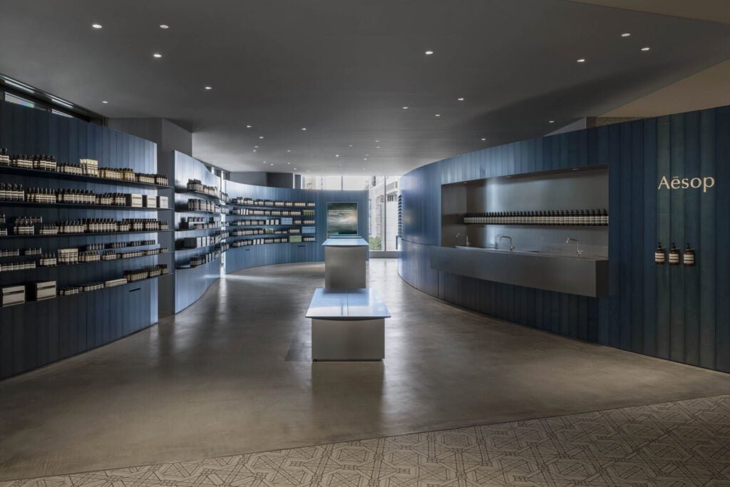
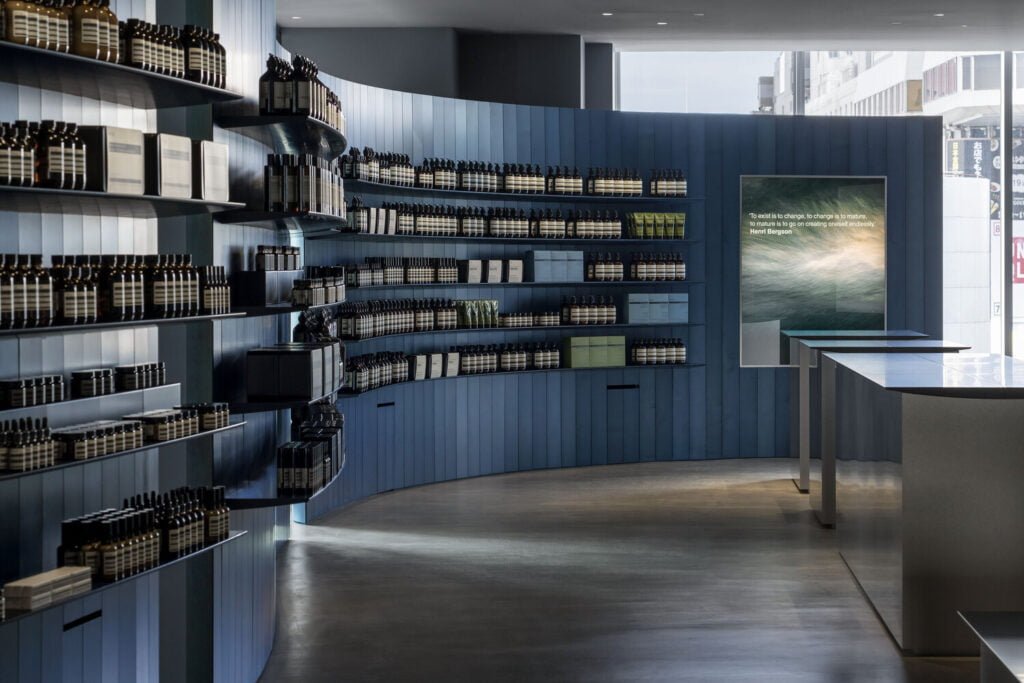
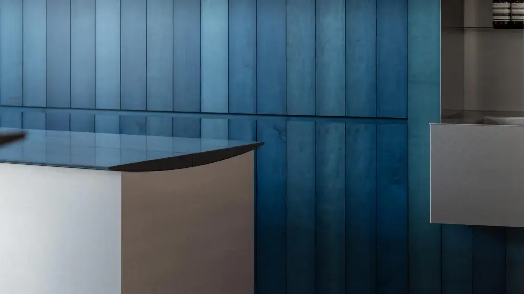
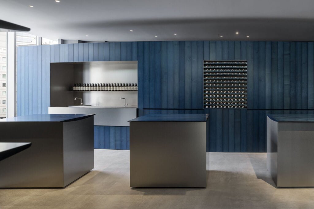
The design of the Aesop boutique is marked by the use of indigo-dyed wood and stainless steel, creating a harmonious and inviting atmosphere. Studio Torafu Architects experimented with various species of wood before selecting maple, chosen for its compatibility with the indigo dye. This combination results in a unique aesthetic that is both striking and serene.
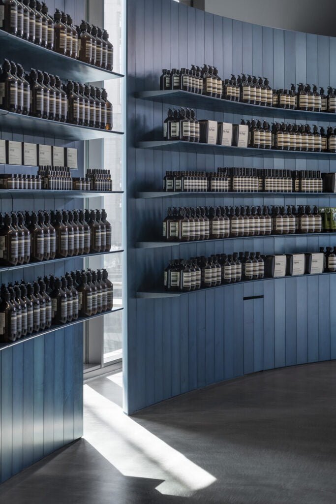
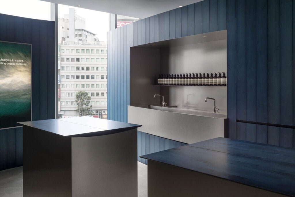
The store’s interior is dominated by a freestanding wall of indigo-colored boards that curves gracefully like the hull of a ship, drawing visitors deeper into the space. This design choice not only creates a sense of flow and movement but also highlights the natural variations in the indigo dye. As the studio notes:
“Even with the same indigo dye, the degree of staining varies depending on the condition of the indigo that day, so the color is not uniform, creating a natural gradation throughout the wall.”
This variability in color, influenced by natural light streaming through windows on either side of the space, adds a dynamic and ever-changing quality to the store’s ambiance.
Integration of Natural and Industrial Elements
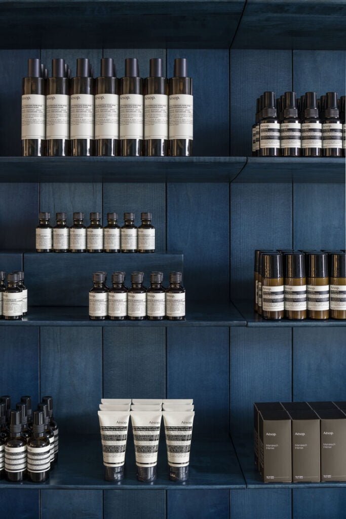
In addition to the indigo-dyed wood, the boutique features other key materials that contribute to its unique character. The floor, made of roughly finished mortar, contrasts with the refined textures of the indigo wood and stainless steel elements. This mix of natural and industrial materials reflects Aesop’s commitment to both nature and modernity.
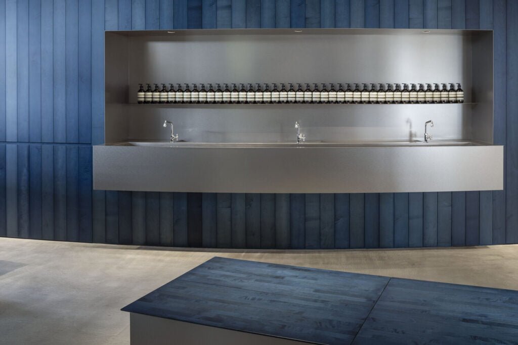
The use of stainless steel is particularly notable in the store’s central sink area and island lighting. The stainless steel surfaces reflect the surrounding indigo tones, enhancing the overall visual cohesion of the space.
photography : Aesop, BUAISOU |TORAFU ARCHITECTS | AESOP Newoman Yokohama
The Craftsmanship and Philosophy Behind the Design
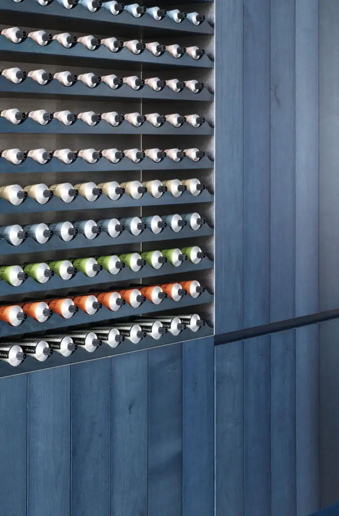
Each plank used in the store was meticulously stained in indigo, a process that not only highlights the artisanal nature of the materials but also aligns with Aesop’s focus on authenticity and craftsmanship. The designers aimed to evoke “a sense of human hands and the power of nature” in the store’s atmosphere, a goal that is evident in the careful attention to detail and the thoughtful integration of natural elements.
The store’s design is not just about aesthetics but also about creating a sensory experience that resonates with customers. The variation in the indigo stain, influenced by natural light, ensures that the space feels alive and ever-changing, much like the natural world that inspires Aesop’s products.
photography : Aesop, BUAISOU |TORAFU ARCHITECTS | AESOP Newoman Yokohama
Conclusion
The Aesop boutique in Yokohama, crafted by Studio Torafu Architects, offers several valuable lessons for those designing cosmetics stores. One key takeaway is the importance of using materials that reflect the brand’s ethos and create a sensory experience. The use of indigo-dyed wood and stainless steel not only aligns with Aesop’s natural and modern image but also creates a tactile and visually engaging env.
Another lesson is the value of integrating local cultural elements into the design, as seen in the choice of Japanese maple and the thoughtful use of indigo dye. This approach can help a store resonate with its local audience and provide a unique shopping experience that sets it ap.
Lastly, the project highlights the importance of creating a dynamic space that evolves with natural light and customer interaction. By designing areas that encourage customers to engage with products directly, such as the central sink area, stores can foster a deeper connection between the brand and its clien.
In essence, this project underscores the need for a holistic design approach that considers materiality, cultural context, and customer experience, providing a template for creating distinct.